I spent a lot of hours in the hospital with my father over the past couple of days. He had a total knee replacement on Monday and was released today (Wednesday) because he is doing so well.
During the waiting, among other things I worked on the new journal. The process for me is very relaxing and meditative. With the last journal I mostly worked on one large spread at a time. Since these pages are quite small, 5.5" x 5.5", I've worked on many at once.


After that, I outline the spiral with a very light black pen line, adding small details such as dots and ovals floating behind the spirals.

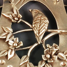
I trim out a printed image of a bird, then audition it from page to page to see where it seems to sing best. These are glued down with a Zig glue pen, which makes it easy to get all the little small extensions attached well. I like to use pen to outline and add details to the bird image, and I may shift the color with watercolor pencil to get more contrast.

I decide upon a phrase or quotation to add to the page, then freehand that in with ink. This is the most nerve-wracking part. What will I do if it doesn't fit? Adjust! Sometimes letters have to jig up and down. Sizes of the letters can change. Words can even break if they need to. Just trust that it will work. What if a letter looks wrong, out of shape or wrong sized? Adjust! Add a decorative spiral or thicken the line in places. This is how I've developed my lettering style that I now do deliberately. Those wedge lines can hide a multitude of original sins.
Finally, there are always blank areas that need more. I have a collection of imagery that I use to fill open areas: tree branches, flying birds, birds on a wire...Hatching and color shifting are always useful to balance the values. I'm always adding new ideas to my toolbox, but it's the repetition and familiarity of the imagery that makes it easy to do, intrinsically part of my work, and easily recognizable.