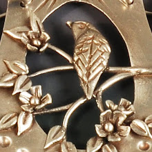
The backsplash installation started today. Several years ago (I'm embarrassed to admit I've been holding these that long!), I commissioned a friend to make accent tiles for a new backsplash. I did mount the tiles she made for my fireplace myself (and I even finished the edge on that!), but never got around to the kitchen project. So when I started designing the kitchen, the tile was a driving force in decisions about colors and surfaces.
This Texas wildflower focal point was hand carved by Melodie Greider of Stickhorse Studios for over my old 30" cooktop. Since I changed to a larger 36" cooktop, I had to add a border to make the work more substantial.
I have another 13-14 of the large diamond tiles that will go somewhere else. Originally I planned to space them out on the perimeter, replacing the original green tiles. Now I think that approach seems dated and would detract from the focal point.
I am debating putting one on either side of the sink window bumpout, but can't decide whether that is a distraction as well. I'll need to make that decision by tomorrow morning, when the tile layer returns to finish off the installation. The tile over the cooktop will go all the way to the ceiling, and then the glass canopy Miele ventilation hood will hang over that, with lots of light to make the special tile pop. The grout lines will make the seams less obvious, not to mention the ever-so-attractive spacers will depart. I also feel relieved that the paint I tried on the wall seems to be perfect.
The focal rectangle took a lot of laying out and plotting to get just right, whereas the staggered 4" x 4" on either side just flew onto the wall. Funny how I tried several other possible layouts to use more of the larger tiles, but finally returned to the original plan. How to waste a weekend mocking up backsplashes in Photoshop!


