Wednesday, September 28, 2011

Developing a Jewelry Design

As I work with glass and silver recently, I'm consciously trying to move the designs forward. Originally I worked with rectangles of glass, since that's the easiest to cut. I combined these with flat mountings at first, then incorporated more decorative elements to go into the third dimension. Last week I finally moved to circles of glass, always harder to cut and grind, especially when they are tiny. I also tried a new setting, using a traditional lentil construction.


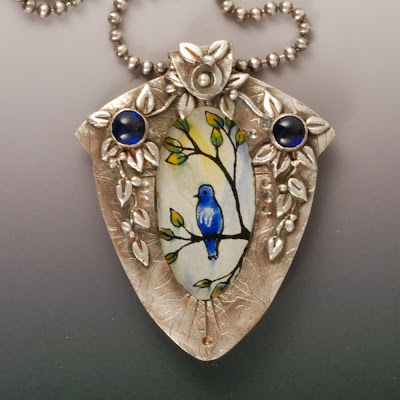
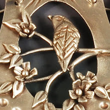
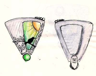
This week, I'm going more free form. I've flipped my process around, making the setting first this round, whereas I usually paint and then design a mounting. It allows me a lot more freedom, as I can do the sizing perfectly the first time with no shrinkage calculations. And I can integrate the design of the setting with the painting, as here where the branch design is part silver 3D sculpted on top and painted glass in the background. It reminds me of my quilt designs where I would flip color values at borders for more interest.


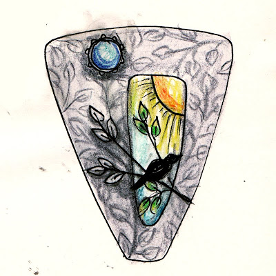
I've gone back to drawing in my sketchbook as well. These two drawings show the evolution of the latest pendant design. I started out with a triangular shape with an offset opening, then in the process of drawing in the texture, I realized I should make the silver and glass work together. So I drew a new version incorporating that idea. The setting was cut and refined easily. Now I need to cut the glass and paint it to assemble tomorrow. Stay tuned.

Monday, September 26, 2011

Art Making Requires Stubborness

I just thought that the studio gremlins had retreated after I vanquished them over the last Garden Window glass and silver pendant. My idea for a new mounting seemed much simpler, but didn't prove to be so.

painted vitreous enamel on glass set in silver pendant by Vickie Hallmark

How many issues were there?

  1. Shrinkage. I calculated based on diameter of the glass disc insert, but didn't account for the thickness. 
  2. Breakage. I tossed the front piece onto the floor going out to the kiln. Three pieces from one!
  3. Poor workmanship. One repaired seam held; the other did not.
I made three glass tiles and two silver mounts before finishing one piece. In effect, it's just a lentil with glass in the center. The simplest of the simple, right? 

back of painted vitreous enamel on glass set in silver pendant by Vickie Hallmark

The glass slumped to fit the curve of the back piece, so it has a nice hollow feel to it. Good thing I did not put it in the kiln upside down, or there would have been a fourth item on the list above.

Thank you, studio gremlins, for finally caving and letting the work move forward. I credit them with having a heart as my birthday hour neared.

Sunday, September 18, 2011

Creativity is Everywhere

Even my fortune cookie is telling me something. Too funny!

Saturday, September 17, 2011

New Glass & Silver Pendant Finally Finished

Why do simple ideas sometimes get more involved? I thought I was going to whip out a few simple Garden Window Pendants, but then the muse took over. The simple oval I've used so many times looked flat and boring, so I cut a new shape. Then I had to carve out the corners to make that triangular shape more reminiscent of birdhouses. I decided to fix the flatness issue by adding a couple of bezel set sapphires and a bunch of vine decorations.

Vickie Hallmark hand-painted enamel bird on glass fine silver pendant

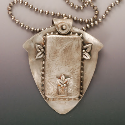
Then the back looked neglected, so I added more leaves and berries there as well. After firing, I tried a plain heavy jumpring bail, intending to texture it with pliers, but that just didn't seem substantial enough. So I cut out a selection of bails. Only to have them be too small after firing. Remember that shrinkage thing, Vic? So I finally got smarter and cut a bail from an index card to match to my original index card template for the pendant. Fool me only once! That simple bail called out for some decorations of its own.

Vickie Hallmark hand-painted enamel bird on glass fine silver pendant back

You can see the next issue coming, can't you? The simple ball chain just won't do. Now I have these visions of a necklace to suit the pendant.

When, oh when, will I get to those other glass paintings?

Wednesday, September 14, 2011

I'm Presenting at the PMC Guild Conference 2012!

As you may know, the final conference ever for the PMC Guild is coming up next summer. After the conference, the Guild is disbanding, so this is should be an especially bittersweet meeting. The program has just been posted, and I'm honored to announce that I'll be abetting Barbara Becker Simon with a demonstration on combining glass with metal clay.


Tim McCreight introduced the team demos last year and they were a big hit. Essentially, the two presenters trade off fast and furious demonstrations for an hour, leaving room for questions as well as entertainment. Barbara and I will try to present an interesting array of ways to combine glass with metal clay, while avoiding the most predictable and well known.

Amongst the speakers: Keynote Speaker Ellen Wieske, Tim McCreight, Jeanette Landenwitch,  Elizabeth Agte, Lisa Cain, Susan Dilger, Celie Fago (w/ Ellen Wieske), Holly Gage, Lora Hart, Hadar Jacobson, Donna Penoyer, Helga van Leipsig. Other demonstrators by Chris Darway and Terry Kowalcik, and a Japanese artist to be announced.

Tuesday, September 13, 2011

Back to Glass with Silver

I have a stack of enamel-painted glass tiles stashed in a drawer for the day when I make new silver mountings for them. Yesterday I cut and formed the metal clay pieces for a new pendant, and today I did a lot of detailed sculptural details on the front -- nothing fancy, but vines, leaves and bezel cups for cabochons. Tonight as the kiln is clicking away, I'm pondering the options for the glass to mount inside.

hand-painted vitreous enamel on glass

There are three types of enamel paintings here. One tile has just the black tracing. Several are reverse painted on clear glass with a coat of white on the back. The others are painted on the front with different enamels. The reverse paintings on clear are more vibrant, but they tend to react more with silver. Which to choose?

This is the technique I'll be teaching October 14-15 in Pennsylvania. One full day will be playing with the various enamels on glass. And the second day will be constructing a setting for one of the glass tiles. There are still seats available. Holly Gage has more information.

Monday, September 12, 2011

Art and Design of Metal Clay Jewelry 2012 Calendar Now Ready to Pre-Order!

The fabulous Holly Gage has done it again! Along with jurors Emma Baird, Tracey Spurgin, and Lesley Messam, Holly selected work from over 300 submitted images to fill the pages of the 11" x 17" (open size) wall calendar.


From the gorgeous detail of Terry Kovalcik's locket on the front cover (above) to the work of the three jurors on the back, the calendar is filled with inspiring images of the best in metal clay today. Works from about forty of the best known and most accomplished artists in the field are accompanied by statements of inspiration or technique and website addresses. The calendar includes conference and competition deadlines to keep you on track.


This edition of the calendar is the most eclectic ever, showcasing silver, rose gold, bronze, copper, and steel clays. Take a look at the calendar preview and pre-order your copy today here.


I'm incredibly honored to be included again this year, with my syringe cloissone Vine earrings showing off enamel with silver clay in the month of October.

Sunday, September 11, 2011

Overcoming Artistic Obstacles

I'm relieved to put this brooch behind me! I finally decided that the message was to use plain copper for the sandwich, rather than enamel. After I finally removed all the enamel from the etching, I just polished it up and proceeded onto the riveting, which was more trouble than usual as well.


Overall, this piece is not what I envisioned, so I guess it's time to go back to the bench and try again. But at least I can call it finished!


There were some successes. I included my first ever commercial pin finding, sterling silver and nickel. That was easy enough. Usually I make my own findings, but it's good to know how to do both. And I had all that practice at enamel removal. And I'm back in gear with etching.

Art is a dance, forward and back.

Friday, September 09, 2011

Removing Vitreous Enamel

Enamel is so beautiful when done correctly and so hard to remove when done wrong! Lately I'm getting a lot of practice with removing enamel. The technique I'm using came from Pam East's book "Enameling on Metal Clay." I've viewed this as a learning curve so as to have this skill in my toolbox when the day comes that I need to remove enamel from silver or copper clay. At the moment,  I'm not removing enamel from metal clay at all. In fact, I'm working traditionally with smooth, sheet copper for my painted enamel, then mounting the enamel in silver via rivets. Even in this simpler situation, removing enamel is laborious and messy. Indeed, sawing a new piece of copper would be much easier, but not as educational. I expect that removing enamel from metal clay might be significantly harder, due to porosity of the metal surface, even if burnished heavily.
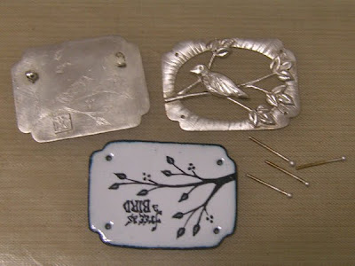
Vickie Hallmark enamel on copper free as a bird fine silver brooch

This particular brooch has been a torturous project. Sometimes, pieces just have a mind of their own. The enamel I used for the first pass at the center layer bled into a black blob, causing me to embark on this enamel removal training. Then I reapplied the enamel carefully and successfully with a different material, only to realize that somewhere along the way I'd rotated the copper so that the text was upside down. I tried another coat of white enamel to see if it would cover the black well enough, but the results were not very successful. Daunted, but determined, I embarked on enamel removal number two.

unsuccessful overcoat
Removing Vitreous Enamel from Copper
  1. Mix equal parts of cream of tartar and salt. Add just enough distilled water to make a creamy paste.
  2. Cover enamel with the paste. Place the work on a sheet of mica.
  3. vitreous enamel removal paste
    paste on enamel on mica
  4. Pop into the kiln at enameling temperature, where the paste will proceed to burn, blacken, bubble. and smoke.
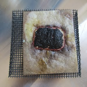
  5. enamel removal paste after heating
    cooked removal paste on enamel
    Pull the piece out and drop immediately into a bowl of cold water (you may have to dig the piece out of the mica with tweezers, as it sinks in). Pick off as much enamel as possible. If the enamel is thick, it may need several treatments, especially if there was counter enamel, as on this piece.
    vitreous enamel removal process
    first pass
  6. Repeat until enamel is gone. Then clean up the copper with a metal brush, sandpaper, pickle, etc.
  7. third pass
Somewhere along in here, I decided to change the enamel to revisit the techniques coming up in the class I'm scheduled to teach in Pennsylvania in October. (Get info here on Holly Gage's Website, and contact her for seat availability.) So I etched a design into the copper instead of painting it. Then I added a layer of enamel, front and back. Usually I do this technique with a torch for control, but I decided to experiment with the kiln instead because we may have better kiln access than torch availability. I became distracted with cleaning up some of the mess in my studio (right in front of the kiln, so an obvious hazard) and overcooked the enamel, causing it to pit. Sigh. Just repeat all those steps shown above, with extra rounds to get all the enamel out of the etching. Call me a pro at removing vitreous enamel!

Thursday, September 08, 2011

Studio Setbacks

Some days are just not good studio days. Today I got SO close to finishing a ring that has sat on my bench for a year. I cut copper discs, then etched, domed, torch-enameled, relief-sanded and heat-patinated both. I chose my favorite for the ring and started to form the bezel around it. One of the reasons this ring mount has been sitting is that I didn't make it quite right. I made the bezel wall a bit too heavy, and I forgot to do the decorative edge before it was fired. Thus, today the bezel didn't fit as neatly as I would have liked, and the plain edge caused me to push the forming a bit too far. One slip and whack onto the enameled copper caused the glass to chip right off. See the bright, shiny copper area in the upper right quadrant? One ruined ring, this close to finished ...


What do you do when some days just go wrong? This isn't the only project I'm trying to progress on today, and it isn't the only one being difficult. 

Sunday, September 04, 2011

How to Personalize Your Design Sketchbook

I've blogged many times about how I use my sketchbooks to work out design ideas. More and more frequently now, I actually reduce sketches to practice, with very close resemblance. For example, I blogged about the long delay while I learned to make the beads I drew in my sketchbook in just the way I'd visualized them here. My motto is "if I can draw it, I can build it." My choice of sketchbook to keep in my bag has heretofore been a large (5"x8.25") Moleskine plain paper sketchbook. I've gone through a stack of them, and more recently I have turned to the Volant soft cover notebooks that come in fun colors.


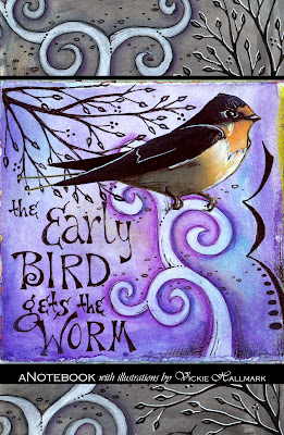
A few weeks ago I was thrilled to receive an announcement from Blurb that they were offering a new blank paper notebook option. As soon as I found a few free moments, I whipped together a sketchbook with illustrations from my Bird Journal and ordered copies in color and black-&-white to inspect. Now I'll be giving them a whirl as new tote-around sketchbooks.

Want a notebook with your own personal artwork on the front? I can imagine lots of possible uses besides sketching -- a log of accomplishments, a 'to-do' list file, a guest book for studio or booth, ... Just follow my easy directions below. My design is also available in my Etsy shop.


Design Your Own Notebook/Sketchbook:

  1. Download BookSmart bookmaking software onto your computer from Blurb.com .
  2. Start BookSmart and select Notebook, a 6" x 9" format book with full-color covers and blank pages. Click Continue.
  3. Choose Lined, Grid or Blank pages, then click Continue.
  4. Upload images from your computer or photo sites (you can add more later). The optimal cover image sizes are 1684 x 2584. I used Photoshop to add borders above and below to my previously square images. Click Continue for the guided step-by-step construction.
  5. Drag photos from the 'My Photo's pane on the left side to the target cover or page.  A slider bar at the bottom lets you scroll through the 100 pages. Just click on the page of choice to edit. This notebook template is set up for photo insertion every sixth page, but you can just leave the entire thing black inside if you prefer. I just drug in one of my high resolution square images to each of the templated image pages. These can be printed later in either color or black&white.
  6. Add text (title and author, for example). I did my text when I added the borders in Photoshop, but it's easy to add here.
  7. Make sure you add the back cover and a copyright statement somewhere inside. 
  8. At any point, click "Preview Book" to see what the book will look like. Beware images at too low resolution -- a yellow warning sign will appear. Return to make changes by clicking "Edit Book."
  9. When the book is finished to your liking, from the Preview, click "Order Book." 
  10. Fill out information about the book, choosing whether it's private or public, add an author bio, set up  preview pricing info, and order from the Blurb link. B/W notebooks are obviously much less expensive than color.  That's all there is to it!