Just out of the kiln this morning. The new kiln worked great! I ramped at 300 and then held at 1500 for two hours and the surfaces are much better. No blistering, great detail. The bronze picked up every bit of the tear-away texture detail.
There are a couple of tiny tears/cracks. One is on the edge of the shield; the other is on the flange around one hole on the lentil.
Not a lot of color, but some, from this second pass through this batch of carbon. I'm going to try running them through the tumbler and torch coloring. So these are the before pics.
The shield bead is a box construction about 2 1/4" long. I was too hesitant to try an open box again after the distortion I got before, although now that it's done I have and idea for getting the two piece to work. I'll have to give it a try.
Monday, September 29, 2008
Bronze Clay Experiments, Take 2
Wednesday, September 24, 2008
Beyond Latticcino
Over the weekend, I took a two day workshop with Al Janelle, a local Austin glass icon, who is returning to working glass after an eight year hiatus. Al is famous for his latticino and other fancy glass canes. His work is spectacularly intricate and perfect.
I am amazed by my first attempts to do some of these complex canes. I've done plenty of simple twisties and a few more complex latticcino, but nothing like what we worked up to in class. Here's my sample haul from the workshop: We started with simple ribbon twists, added floating threads, and finally made this incredible triple ribbon. I did mine with double threads of goldstone floating over each white ribbon edge. It's not quite perfectly spaced, but it's by far the fanciest cane I've ever made.
And then there was the fact that it was just plain exhilarating to hang out with a bunch of fun glass people!
Monday, September 15, 2008
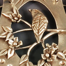
Tear-Away Texture Results


A new piece made with a clip-art tear-away -- a bird among the leaves. The keum boo worked great, but I don't like the random placement. This may get a run through the kiln again for my first round of removing gold and patina.
I do like my new photopolymer plate to make my standard logo, which is affixed to the back.
Sunday, September 14, 2008
Artwork for Metal Clay
I finally secured the right copier on e-bay to do tear-away texture sheets. Then I ordered paper. Finally this week, I've been able to give it a try. After a few poor tests, I've finally got the hang of it, I think. For all the tests I used some Dover clipart books (with CD) to make it a relatively painless process.
After trying a few of those on silver clay last night, I found myself wanting my own drawings. Out came the paper and pens to draw some. The prickly pear cactus tear away sheets didn't give the look I wanted, so I decided they just needed to be more pronounced, as with photopolymer plates.
 Unfortunately, that wasn't really the issue. The problem was that I hadn't thoroughly thought through how to draw what I wanted to appear. Making either the PPP or the tear-away is one of those weird reverse processes. For tear-aways, both positive and negative are produced at the same time. The black ink on the paper will attach polymer clay, which after baking will leave a depression in the metal clay. The polymer clay left behind can be used as a plate to make a raised image. For photopolymer plates (PPP), what I draw in black on the paper will be protected from the sun, so wash away. That depression will be filled with clay, so it will be raised in the final product. It's enough to make my head spin!
After trying a few, I figured out that my real problem was the outline drawings I made. My first PPPs were beginner's luck, because I used filled drawings without thinking it through. Now I needed to run back upstairs to get the lightbox out and fill in my outline drawings and thicken up lines to get better plates.
 Now I'm ready to make more plates, more tear-aways, and try the clay again! Sheesh, most of the weekend is gone and I don't have what I wanted done!!!!
Tuesday, September 09, 2008
Halloween Colors
I went clothes shopping on Sunday, something I rarely do. Sometimes special occasions require new clothes and I can't get out of it. I have no difficulty shopping for art supplies, tools or even power equipment, but clothes just don't excite me. I prefer my fabric in nice flat pieces that I can cut! I used to sew my own clothing, but not for many years, since the internet made finding duds that will fit my 5'11" frame easier than going in person.
Imagine my surprise to find that orange is in fashion! I've always loved orange. I had an orange spread on my bed when I was starting high school. I use it, and yellow, in quilts all the time because it adds so much zing.
I've made a lot of orange beads recently, including this pineapple and pumpkin colored bird vessel, which I've decided deserves the name Halloween Wren: BTW, I bought a paisley borderprint skirt and solid shell in orange for the special event. Now I'm online at Zappo's looking at orange shoes. Maybe I should go to the mall more often!
Friday, September 05, 2008
Silver Bird Pod

I've also been cutting out artist profiles for a binder. I just slip them into protective sleeves, one article per sleeve. I do the same thing for projects that interest me.
In Art Jewelry, I found a step-by-step tutorial for a metal clay pendant that I've always loved. Celie Fago is perhaps my favorite metal clay artist and I've followed her work for years now. Funny, I never noticed before that she calls these pods. Oh, now I know why I like it. I thought it was just because that shield shape shows up in my Book of Attractions more than any other.
 front
front So both the front and back have the bird and nest: nest on top on one side, nest on bottom on the other. Then I made the sides and pulled out the teeny, tiny 1/16" letter stamps I bought in Purdue. After a bit of search on the web, I found a bird quotation to wrap around the sides of the structure:

I tried and tried to do beaded silver wires like the gold ones in the tutorial pod, but my micro-butane torch just couldn't handle the wire when it had the heat sink of the pod right next to it. I even got bold and hit it with my glass torch, but that just doesn't have a fine enough flame. So I gave up and just finished the back of the bail connection like a rivet. It's probably not strong enough, but it's going to do for this iteration.
Oh, did I mention that I worked out of order? Silly me, I patinated the box to the most beautiful blue you've ever seen -- night sky at the nest? -- and THEN I torched the thing and ruined it. Oh, well. Lesson learned. I'll get to live with plain dark black sky.
Finally, I used an image of two barn swallows -- one on a branch and one flying -- with the word soar to fill the pod. I got to use the new ICE resin which I purchased from Susan Lenart Kazmer at Bead & Button. I had trouble with the resin, too. It's hard to measure accurately because the hardener is much less viscous than the resin. The blue paint I added didn't mix in very well. But worst was that it didn't level -- it wicked up and over the edge and went places I didn't want it to go.
So, I have a long list of things I don't like about this one that I'm going to try to fix in a second version: patina, texture on the sides competing with text, the bail, resin overflow, color of the resin.
It's good to earn respect for the artist's who write these tutorials and teach classes. When everything goes flawlessly, it seems so easy! When trouble strikes and restrikes, it takes real perseverance to get it perfect.
Tuesday, September 02, 2008
Silver and Gold Alchemy
Playing with bronze got me fired up to try out some of the silver clay hoard I purchased after the PMC Conference. Time to put the new lentil construction skills to work. And test out the possibilities of keum boo at home. I borrowed a PMC kiln from Blue Moon Glassworks to see if I like it enough to order one of my own (birthday coming!). So far I LOVE it!
Here's the first attempt. Hollow lentil with 22K gold keum boo bird on one side and nest with gold eggs on the reverse. These imprints are from my own drawings made into photopolymer plates. Only oops -- the bird and nest relative orientation somehow skewed from what I planned. Note to self: double check that better next time!
The box construction is mostly done. I'm working on the bail and finishing details.